Last updated: May 10, 2026
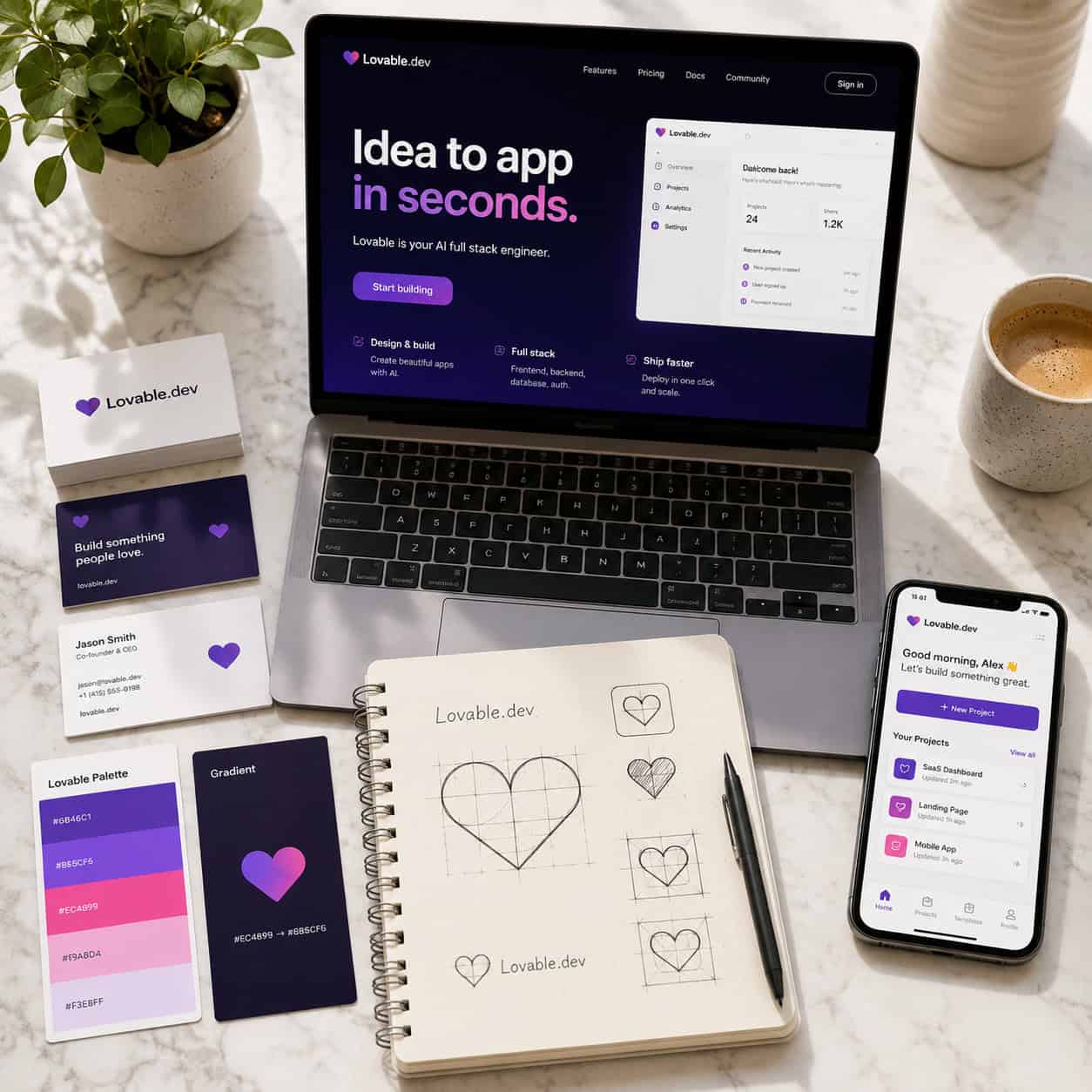
Quick Answer: The Lovable.dev logo uses a clean, minimalist heart-inspired mark paired with modern sans-serif typography, reflecting the platform’s mission of making app building accessible and friendly through AI. Its visual identity leans on soft purple and pink tones, simple geometry, and approachable design — a deliberate contrast to the complex, code-heavy branding of traditional developer tools.
Key Takeaways
- Lovable.dev’s logo centers on a heart motif that reinforces the brand name and signals approachability over technical intimidation.
- The color palette uses purple and pink gradients, associating the brand with creativity, innovation, and warmth.
- Minimalist design choices align with the platform’s “vibe coding” philosophy — fast, conversational, and low-friction [8].
- Compared to competitors like Bubble or v0.dev, Lovable’s branding is deliberately simpler, trading visual complexity for immediate recognition.
- The logo works well at small sizes (favicons, mobile icons) because of its geometric simplicity.
- Lovable’s Themes feature (launched late 2025) lets users apply consistent branding — including logos — across projects, reinforcing the company’s own brand-first philosophy.
- Critics argue the friendly branding may understate the platform’s technical limitations, especially for production-scale apps [7].
What Does the Lovable.dev Logo Actually Look Like?
The Lovable.dev logo combines a stylized heart icon with the wordmark “lovable” in a clean, lowercase sans-serif typeface. The heart shape is rendered with smooth curves and minimal detail, often appearing in a purple-to-pink gradient.
Key visual elements include:
- Heart icon: A simplified, geometric heart that doubles as the brand’s favicon and app icon. It avoids the ornate or skeuomorphic style common in older software branding.
- Lowercase wordmark: The name “lovable” appears in all lowercase, which softens the brand’s tone and makes it feel conversational rather than corporate.
- Color palette: Primary colors sit in the purple-pink spectrum. Purple is widely associated with creativity and innovation, while pink adds warmth and friendliness.
- No tagline in the logo itself: The mark stays uncluttered, relying on the icon and name alone.
This approach mirrors a broader trend in tech branding where AI-first companies favor simplicity. If you’re building your own brand identity, understanding how to use color palettes effectively is a good starting point.
Why Does Lovable.dev’s Branding Use a Heart Symbol?
The heart directly connects to the word “lovable.” It’s a literal visual translation of the brand name, which makes the logo easier to remember and recognize.
But there’s a strategic layer too. Most developer tools use brackets, blocks, or abstract geometric shapes in their logos — symbols that signal “code” or “building.” Lovable.dev deliberately breaks from that convention. The heart says: this tool is for everyone, not just engineers.
This choice supports Lovable’s positioning as a chat-based app builder where users describe what they want in plain language, and the AI generates working code [8]. The branding needs to feel welcoming to non-technical users — designers, founders, marketers — who might be intimidated by a more technical-looking logo.
Common mistake: Assuming a “friendly” logo means the product isn’t serious. Lovable.dev’s branding walks a fine line. The minimalism keeps it professional, while the heart keeps it approachable. Lovable’s own corporate branding strategy guide emphasizes that brand identity should match the product’s core promise [3].
How Does the Lovable.dev Logo Compare to Competitors?
The Lovable.dev logo stands apart from most AI and no-code tool branding. Here’s how it stacks up:
| Feature | Lovable.dev | Bubble | v0.dev (Vercel) | Replit |
|---|---|---|---|---|
| Icon style | Heart / organic | Circles / modular blocks | Minimal text mark | Code bracket / playful |
| Color palette | Purple-pink gradient | Blue-white | Black-white | Orange-blue |
| Typography | Lowercase sans-serif | Mixed case sans-serif | Monospace-inspired | Rounded sans-serif |
| Overall tone | Warm, approachable | Professional, structured | Developer-focused, minimal | Casual, energetic |
| Target audience signal | Non-technical + technical | Business users | Frontend developers | Developers + learners |
Lovable’s branding is the most emotionally warm in this group. Bubble’s modular icon suggests building blocks. v0.dev keeps things stark and code-oriented. Replit uses playful energy but still leans technical.
Choose Lovable’s approach if your product targets a mixed audience of technical and non-technical users. Choose a more code-iconic style if your audience is primarily developers who want to see “this is a dev tool” immediately.
For a broader look at platforms in this space, see our roundup of the best no-coding website design software platforms for 2026.
Analysts at Fastdev have noted that Lovable’s simpler design suits AI-first simplicity but may lack memorability compared to more distinctive marks [7]. That’s a fair critique — the heart shape is common in many industries, from health to dating apps, so Lovable relies heavily on its color palette and wordmark to differentiate.
What Design Principles Drive the Lovable.dev Visual Identity?
Three core principles shape the Lovable.dev logo and broader brand system:
1. Minimalism over complexity Every element serves a purpose. There are no gradients-for-the-sake-of-gradients, no unnecessary outlines, no secondary icons. This keeps the logo legible at any size — from a browser tab to a billboard.
2. Emotional connection first The heart, the soft colors, the lowercase type — all of these prioritize feeling over function. Lovable wants users to feel comfortable before they even sign up. Their guides on logo design reinforce this principle, advising that logos should “stand out” through emotional resonance rather than visual noise [10].
3. Consistency across touchpoints Lovable’s Themes feature lets users maintain visual consistency across projects they build on the platform. The company practices what it preaches: its own logo, colors, and typography remain consistent across the website, documentation, social media, and in-app experience.
If you’re working on your own brand’s visual consistency, tools like Figma are essential. Our guide on Figma UI kits and design systems covers how to set up reusable brand components.
Can You Customize Branding Inside Lovable.dev Projects?
Yes. Lovable.dev supports custom logos, images, and brand elements within projects you build on the platform.
A recent tutorial demonstrates how to add custom logos and images to Lovable projects [4], and the platform’s design templates feature (updated April 2026) provides pre-built layouts that maintain brand consistency across pages.
Here’s what you can customize:
- Project logos: Upload your own logo to replace defaults in apps you build.
- Color themes: Apply brand colors globally using the Themes feature.
- Typography: Set custom fonts that carry across components.
- Favicon and app icons: Control how your project appears in browser tabs and on mobile home screens.
Edge case: If you’re building a client project on Lovable, make sure to export or document your brand settings. Reddit users have noted that transferring brand guidelines between Lovable and tools like Figma requires some manual work. For tips on bridging design tools, check out our guide on mastering UI/UX design principles in Figma.
Does the Lovable.dev Logo Accurately Represent the Product?
This is where opinions split. Supporters say the logo perfectly captures Lovable’s promise: building apps should be easy, fast, and even enjoyable. The heart icon and friendly colors deliver that message before a user reads a single word of copy.
Critics push back. Some developers on Reddit have argued that Lovable’s approachable branding — logo included — overpromises what the platform can deliver at scale [7]. The concern is that a “friendly facade” might attract users who then hit limitations when trying to build production-grade applications.
My take: A logo’s job is to communicate brand values, not product specifications. Lovable’s logo does exactly what it should — it signals accessibility and warmth. Whether the product delivers on that promise is a separate (and valid) conversation. The branding itself is well-executed for its target audience.
Lovable’s own guides on corporate branding strategy support this view, arguing that brand identity should align with the company’s mission and values rather than trying to communicate every feature [3].
How to Apply Lovable.dev’s Branding Lessons to Your Own Logo
If you’re inspired by Lovable’s approach, here are concrete steps:
- Start with your brand’s core emotion. What should users feel when they see your logo? Write it down in one word.
- Choose a symbol that connects to your name. Literal connections (like heart = lovable) are easier to remember than abstract ones.
- Limit your color palette to 2-3 colors. Lovable uses purple and pink. Pick colors that reinforce your brand emotion.
- Test at small sizes first. If your logo doesn’t work as a 16×16 pixel favicon, simplify it.
- Use lowercase type if your brand is conversational. Reserve uppercase for brands that need to project authority or formality.
- Document everything in a brand guide. Colors (with hex codes), spacing rules, acceptable variations, and usage restrictions.
For hands-on logo creation, our beginner’s guide to designing a logo in Canva walks through the full process. And if you want to explore AI-assisted design, see our overview of the best AI graphic design tools for creative workflows.
Conclusion
The Lovable.dev logo is a case study in purposeful simplicity. The heart icon, soft purple-pink palette, and lowercase wordmark all serve a single goal: making AI-powered app building feel accessible to everyone. It’s a deliberate departure from the code-heavy, block-based branding of traditional developer tools, and it works well for the audience Lovable targets.
Whether you’re analyzing the logo for competitive research or drawing inspiration for your own brand, the key lesson is alignment. Lovable’s visual identity matches its product philosophy — conversational, fast, and friendly. Your logo should do the same for your brand.
Next steps:
- Audit your own logo against the principles above (emotional clarity, scalability, consistency).
- Test your logo at favicon size — if it’s unreadable, it needs work.
- Build a simple brand guide with your colors, fonts, and logo usage rules.
- Explore Lovable.dev’s branding guides [3] and logo design resources [9] for more practical frameworks.
FAQ
What does the Lovable.dev logo look like? It’s a stylized heart icon in a purple-pink gradient, paired with the lowercase wordmark “lovable” in a clean sans-serif font.
Why does Lovable.dev use a heart in its logo? The heart is a direct visual reference to the brand name “lovable,” signaling warmth and approachability to both technical and non-technical users.
What colors does the Lovable.dev brand use? The primary palette centers on purple and pink tones, often rendered as gradients. These colors associate the brand with creativity and friendliness.
Can I add my own logo to projects built on Lovable.dev? Yes. Lovable supports custom logos, color themes, typography, and favicons within projects you build on the platform [4].
How does the Lovable.dev logo compare to other AI builder logos? It’s simpler and warmer than most competitors. Tools like Bubble use modular block icons, while v0.dev uses stark black-and-white text marks. Lovable’s heart icon is the most emotionally expressive in the category.
Is the Lovable.dev logo effective for brand recognition? It’s highly legible and works well at small sizes. However, some analysts note that heart shapes are common across industries, which could reduce distinctiveness [7].
Has the Lovable.dev logo changed recently? As of May 2026, there have been no announced logo redesigns. The current mark has remained consistent since the platform’s branding was established.
What font does Lovable.dev use in its logo? The wordmark uses a modern, geometric sans-serif typeface in lowercase. The exact font name hasn’t been publicly disclosed, but it resembles popular geometric sans-serif families.
Does Lovable.dev offer branding tools for users? Yes. The Themes feature and design templates allow users to maintain consistent branding across their Lovable-built applications [3].
Where can I learn more about logo design principles like those used by Lovable.dev? Lovable.dev publishes its own guides on logo design [1] [10], and platforms like Canva and Figma offer hands-on tools for creating brand identities.
References
[1] How To Create Professional Barber Logos – https://lovable.dev/guides/how-to-create-professional-barber-logos [3] Corporate Branding Strategy Guide – https://lovable.dev/guides/corporate-branding-strategy-guide [4] Watch – https://www.youtube.com/watch?v=7IpspaFT0po [7] Startups Scaleups Lovable Limitations – https://www.fastdev.com/blog/blog/startups-scaleups-lovable-limitations/ [8] Glossary – https://docs.lovable.dev/glossary [9] Build Logo Design Projects Lovable – https://seahawkmedia.com/design/build-logo-design-projects-lovable/ [10] How To Make A Purple Logo That Stands Out – https://lovable.dev/guides/how-to-make-a-purple-logo-that-stands-out