Last updated: May 9, 2026
Quick Answer: Bolt AI’s logo centers on a lightning bolt symbol that communicates speed, efficiency, and instant action. The design uses negative space within the wordmark to form that lightning shape, while electric yellow reinforces energy and urgency. Together, these choices make the brand immediately recognizable and deeply tied to what the product actually does.
Key Takeaways
- ⚡ The lightning bolt is the core visual metaphor, representing fast, frictionless digital experiences
- 🎨 Electric yellow is the dominant brand color, chosen for its energy and high visibility
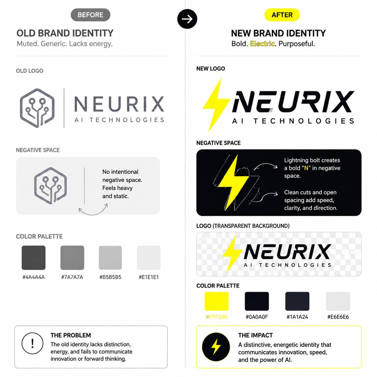
- 🔲 Negative space between letterforms creates the lightning shape without adding extra graphic elements
- 🖥️ Bolt.new’s logo received a transparency-focused update created using Canva, emphasizing a cleaner aesthetic [1]
- 🏷️ The Bolt ecommerce rebrand (handled by agency Koto) deliberately embedded the lightning silhouette into the wordmark itself [2]
- 💡 Every design decision connects directly to the brand’s core promise: speed and simplicity
- 🔄 The 2022 rebrand introduced striking electric yellow as the primary color palette element [3]
- 📐 Geometric precision and minimal detail keep the logo scalable across all screen sizes
What Is the Bolt AI Logo, and Why Does It Matter?
The Bolt AI logo is more than a wordmark. It’s a compressed brand promise. At first glance, it reads as a clean, modern tech logo. Look closer, and the design is doing real strategic work.
For any AI or tech product, a logo is often the first trust signal a user encounters. Before someone reads a single line of copy, the visual identity has already told them something about the product’s personality, speed, and reliability. Decoding the design: the story behind Bolt AI’s iconic logo starts with understanding that every element, from color to shape to spacing, was chosen with a specific message in mind.
Why this matters for brand strategy:
- Users form visual impressions in under 100 milliseconds (based on general UX research consensus)
- A logo that reflects core functionality reduces the cognitive gap between brand promise and user expectation
- Consistency across logo versions (standard, transparent, dark mode) builds recognition faster
How Does the Lightning Bolt Symbol Connect to Bolt’s Brand Mission?
The lightning bolt directly represents the brand’s core value proposition: speed. This isn’t accidental decoration.
For Bolt’s ecommerce product, the lightning shape symbolizes “lightning fast” checkout and efficient transactions [2]. The symbol works on two levels simultaneously. It’s a literal reference to electrical speed, and it’s also a cultural shorthand for urgency and power that most users already understand without explanation.
What makes this symbol choice effective:
| Design Element | What It Communicates | Why It Works |
|---|---|---|
| Lightning bolt shape | Speed, instant action | Culturally universal symbol |
| Sharp geometric angles | Precision, efficiency | Feels tech-forward |
| Single unified form | Simplicity, clarity | Scales well at small sizes |
| Electric yellow color | Energy, optimism | High contrast, memorable |
The agency Koto, which handled the Bolt ecommerce rebrand, took this a step further by embedding the lightning silhouette directly into the negative space of the wordmark itself [2]. This means the logo communicates “bolt” even when you’re only reading the letters.
“The best logos don’t just represent a brand — they demonstrate it.” This is exactly what Bolt’s lightning motif achieves: the design itself moves fast.
What Role Does Negative Space Play in the Bolt Wordmark?
Negative space is the deliberate use of empty areas within or around a design to create a secondary visual. In Bolt’s case, the gaps between specific letters form a recognizable lightning shape [2].
This is a sophisticated technique. Rather than placing a separate lightning bolt icon next to the brand name, the design team built the symbol into the letterforms themselves. The result is a logo that rewards attention, where casual viewers see a clean wordmark, but engaged viewers notice the hidden shape.
How to spot negative space in logo design:
- Squint at the logo to blur fine details
- Focus on the dark areas between letters rather than the letters themselves
- Look for geometric shapes (triangles, arrows, diagonals) formed by the gaps
Common mistake: Many brands add decorative icons beside their wordmark instead of integrating symbolism into the type. Bolt’s approach is harder to execute but far more elegant.
If you’re interested in applying similar principles to your own brand visuals, our guide on how to use color palettes for your Canva designs covers the foundational decisions that make or break a visual identity.
Why Did Bolt Choose Electric Yellow as Its Primary Color?
Electric yellow became Bolt’s dominant brand color during the 2022 rebrand, and it wasn’t chosen arbitrarily [3]. Yellow sits at the intersection of energy, speed, and optimism in color psychology, making it a natural fit for a brand built around fast transactions.
From a practical standpoint, electric yellow also has strong contrast against both white and dark backgrounds, which matters enormously for a digital-first brand appearing across apps, websites, and marketing materials.
Color psychology breakdown for electric yellow:
- Energy and urgency: Yellow triggers alertness, which aligns with fast-checkout messaging
- Optimism: Lighter yellows feel friendly and approachable, reducing friction in financial transactions
- Visibility: High chroma yellow is one of the most visible colors on screen, especially on mobile
Choose yellow if: your brand needs to communicate speed, confidence, or positive action without the aggression of red or the coldness of blue.
For designers building similar brand systems, understanding how to master graphic design for social media marketing success provides a practical framework for applying color strategy consistently across channels.
How Was the Transparent Logo Version Created and Why Does It Matter?
Bolt.new’s logo received a notable update that introduced a transparent background version, created using Canva [1]. This might sound like a minor technical detail, but it has significant practical implications.
A transparent logo (PNG with no background) can sit cleanly on any surface, whether that’s a dark hero section, a light product page, a video overlay, or a partner’s website. Without transparency, a logo carries its own background color everywhere it goes, which creates visual conflicts and looks unprofessional.
Why transparency is a non-negotiable for modern brand assets:
- Enables consistent branding across light and dark interfaces
- Required for video watermarks and presentation overlays
- Prevents the “white box” problem on colored backgrounds
- Supports dark mode design without creating a separate asset
If you want to create your own transparent logo assets, our beginner-friendly guide on how to design a logo in Canva walks through the exact export settings you need.
Decoding the Design: What Can Designers Learn From Bolt AI’s Branding Approach?
Decoding the design: the story behind Bolt AI’s iconic logo offers several lessons that apply to any brand building a visual identity in 2026.
The Bolt approach demonstrates that the most effective logos are functional first. Every visual element earns its place by reinforcing what the product does or how it makes users feel. There’s no decoration for decoration’s sake.
Five practical lessons from Bolt’s logo strategy:
- Let the symbol do double duty. If your icon and wordmark can communicate the same idea simultaneously (as Bolt’s negative space does), you’ve created a stronger, more memorable mark.
- Choose a color that matches your brand’s emotional promise. Bolt’s yellow isn’t just attractive; it’s strategically accurate.
- Design for scalability from day one. A logo that works at 16px favicon size and 2000px billboard size requires geometric simplicity.
- Invest in a transparent asset library. Multiple logo versions (light, dark, transparent, monochrome) aren’t extras; they’re essentials.
- Connect every design decision to a brand statement. If you can’t explain why a color or shape was chosen, it probably shouldn’t be there.
For those exploring AI-assisted design workflows, the best AI graphic design tools for creative workflows covers tools that can accelerate logo iteration and brand system development.
How Does Bolt AI’s Logo Compare to Other AI Brand Identities?
Most AI company logos in 2026 follow one of two visual patterns: abstract geometric shapes (often suggesting neural networks or data flows) or minimal wordmarks with a single symbolic accent. Bolt’s logo sits firmly in the second category, but with a twist.
Where competitors often choose blue, purple, or silver to signal “intelligence” and “trust,” Bolt’s electric yellow is a deliberate departure. It prioritizes energy over authority, speed over sophistication. That’s a brand positioning choice as much as a design choice.
Quick comparison of AI brand color strategies:
| Brand Approach | Common Colors | Emotional Signal |
|---|---|---|
| Authority-first AI brands | Deep blue, navy | Trust, stability |
| Innovation-first AI brands | Purple, violet | Creativity, forward-thinking |
| Speed-first AI brands (Bolt) | Electric yellow, black | Energy, urgency, action |
If you’re building a web presence to match a strong visual identity like this, tools covered in our roundup of 11 best no-coding website design software platforms for 2026 can help you translate brand colors and logo assets into a cohesive site without writing a line of code.
FAQ: Bolt AI Logo Design
Q: What does the lightning bolt in Bolt’s logo represent? It represents speed and efficiency, specifically the brand’s promise of fast, frictionless digital transactions and AI-powered web development [2].
Q: Who designed the Bolt ecommerce logo rebrand? Design agency Koto handled the Bolt ecommerce rebrand, incorporating the negative space lightning technique into the wordmark [2].
Q: What color is Bolt’s primary brand color? Electric yellow, introduced prominently during the 2022 rebrand [3].
Q: Why does Bolt have a transparent logo version? The transparent version allows the logo to sit cleanly on any background color or image, which is essential for consistent branding across digital and print surfaces [1].
Q: What design tool was used to create Bolt.new’s updated logo? The transparent logo update for Bolt.new was created using Canva [1].
Q: What is negative space in logo design? Negative space refers to the empty areas within or around a design that form a secondary visual shape. In Bolt’s wordmark, the gaps between letters create a lightning bolt silhouette [2].
Q: Is the Bolt AI logo the same as the Bolt ecommerce logo? They share the same lightning bolt concept and visual language, but Bolt.new (the AI web development agent) and Bolt the ecommerce platform are separate products with related but distinct branding.
Q: Can I recreate a similar logo style using free tools? Yes. Tools like Canva support transparent exports and geometric logo creation. See our guide on Canva AI design assistant features for AI-assisted design options.
Q: Why is scalability important for a tech logo? Tech logos appear at many sizes, from browser favicons to conference banners. A geometrically simple logo stays readable at every scale without losing its core shape.
Q: What makes a logo “iconic” in the AI space? Iconic logos in AI branding tend to combine a clear symbolic shorthand, a distinctive color, and a design that reflects the product’s actual function rather than generic tech aesthetics.
Conclusion: What Bolt AI’s Logo Teaches Us About Brand Design in 2026
Decoding the design: the story behind Bolt AI’s iconic logo reveals a master class in purposeful branding. Every element, the lightning bolt, the negative space technique, the electric yellow, the transparent asset library, connects back to a single brand truth: speed matters.
Actionable next steps for designers and brand builders:
- Audit your current logo against the five lessons above. Can you explain every design choice in terms of brand value?
- Create a transparent PNG version of your logo if you don’t have one. It’s a small step with a large practical payoff.
- Test your logo at small sizes. If it loses its core shape at favicon dimensions, simplify the geometry.
- Choose your brand color strategically. Match the emotional signal of the color to your product’s core promise.
- Explore AI design tools to accelerate logo iteration. Our overview of the best AI graphic design tools for creative workflows is a good starting point.
The Bolt logo works because it doesn’t try to do too much. It picks one idea (speed), finds the most direct visual expression of that idea (a lightning bolt), and executes it with precision. That’s a formula worth borrowing.
References
[1] Watch – https://www.youtube.com/watch?v=6DN7LnTIytA [2] Bolt Logo – https://www.creativebloq.com/news/bolt-logo [3] Watch – https://www.youtube.com/watch?v=jcXhaomGS4s


